I downloaded the picture of the bridge and removed the background and converted it to a monochrome. I drew three overlapping circles to divide the length into equal parts. The circles are also the base shape for the overlapping two ‘M’s that I had in mind.

I stylized the bridge and constructed three arcs to make the overlapping ‘M’s. The first ‘M’ is indicated by a red marker. Notches were added to the top of the arcs to make it look like arches of the mosque to have a feel of Islamic where mosques are the central body of the community.

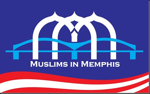
Here is the completed construction with the first ‘M’ in front of the bridge while the second is behind the bridge. While the ‘i’ is at the centre at the intersection of the two ‘M’s. The logo is well integrated with the bridge just as the Muslim community in Memphis integrating themselves with other communities by building bridges among them.

The final construction was exported to Adobe Illustrator for coloring to make it available for printing works. The white ‘M’ represent sincerity while the red and white stripes were added for that American touch. After all the Muslims in Memphis are part of the American society. Though I have left Memphis long time ago but this logo made me feel close to this community that I love so dearest. I hope with this logo my presence is still felt there.
Link: Muslims in Memphis website
Technorati Tags: Muslims in Memphis