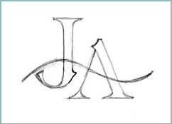
Logo design is not as simple as it may seems. A lot of thoughts go into it. It is not just a graphic or text and colours. It is building an image of a company or organization. That is why some logos can cost thousands of dollars even if the initial idea started on a piece of napkin.
I really don’t design logos professionally nowadays unless it is for close friends and family. The above logo was designed for my sister’s fashion academy. She got a unique name that sells. It inspires the initials effortlessly of high fashion. It has the aura that add the shine to most fashion items. The iconic look will help business expansion.
As most of my design it started in my head. I was thinking of a sans-serif font. Then I add a blunt hook down the corner of the ‘J’ like a bud stem that represent new ideas. Then I add a wave across the two letters for the flare to bind it together like a family.
For the construction I used my autocad software Rhino 3D instead of Adobe Illustrator. As a 3D artist I am much at home with Rhino and its precision. Then I export it to Illustrator for the printers to use.
This is how the logo been reformatted for the design of the entrance. You can find out the progress of JELITA AZIZ Fashion Academy on the web:
Blog: http://www.jafashionacademy.blogspot.com
facebook: https://www.facebook.com/JA.Fashion.Academy


